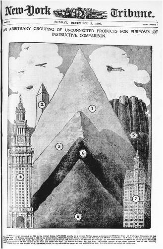
 I've always loved infographics. But are we missing a trick in not using them more often?
The first recorded infographics were early cave drawings.
And infographics have been a constant, creative and brilliantly simple medium guiding, helping and directing us ever since.
They take so many forms, from weather maps to motorway signs.
If you have been abroad this summer then you probably got around just that little bit easier because of infographics. They are universal, they are 'easy-read', they cross boundaries and language.
What's not to like.
So why don't we use them more often in our communications roles?
Yes, I know we all use use them on some level, even if it's something as simple as a graph to show an increase or a decrease in something we're measuring.
